
The Power of Minimalism in Web Design
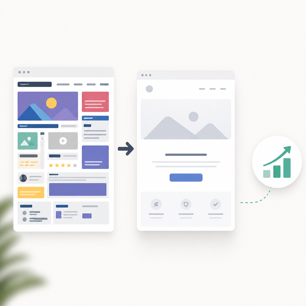
Minimalism isn’t just about stark whites and lots of empty space. It’s about clarity—ensuring your message isn’t lost in the noise. But how can it help website conversion rates? Let’s think about distractions for a moment. Have you ever landed on a cluttered webpage and immediately felt overwhelmed, unsure where to click first? Minimalist designs eliminate such confusion, honing the user's focus and guiding them naturally towards the desired action, like signing up for a newsletter or making a purchase. But it's more than knocking out unnecessary elements; it's about purposeful curation.
Actually, let me put that differently. Minimalism is like editing a piece of writing. You’re not just cutting words; you’re crafting a more powerful message. In a digital landscape where every second counts, a clean, minimalist landing page can significantly decrease bounce rates and increase user engagement.
Simplicity is Subtle: Navigation Matters
Navigation is the silent hero of conversion. Visitors must easily find what they’re looking for, but often, navigation menus are a jumbled mess. Here’s a hack: simplify it. Use a single, uncluttered bar with minimal options. Think of it like a compass with only the cardinal directions. Simplifying the navigation not only improves the user experience but also aids in increasing your conversions by minimizing clicks to critical pages.
Consider the impacts this might have. A simplified menu makes it easy for users to understand where they are and where they can go. This clarity is crucial, especially when less is clearly more. As Steve Krug puts it in his popular book, “Don’t Make Me Think,” the easier it is to "get around", the longer users will stay to explore.
Case Study: Less is More in Action
For some real-world inspiration, take a look at digital giants like Apple and Google. Their products’ navigation is strikingly simple. With minimalist design, they highlight what really matters—their products. A sleek and simple menu boosts user experience and in turn, enhances conversion rates.
The Art of the Perfect Call-to-Action (CTA)
What’s the main action you want your visitors to take? This very question needs answering before anything else because, to truly capitalize on minimalism, your CTA must be loud and clear. Here’s a hack: make it the only attention-grabbing element on the page. Contrast it with the surrounding elements, but keep the rest of the design quiet.
Here's the thing: a well-placed CTA with the right color contrast and compelling copy can increase your conversions through the roof. You want it to be visually prominent but not obnoxious.
The truth is, putting a button at every scroll stop dilutes its impact. Strategic placement and contrasting colors with concise, persuasive copy are key.
Examples with Impact
Look, consider Netflix's call-to-action: “Get Started”. It's simple, direct, and the red button against a dark background pops. It catches your eye, doesn’t it? By reducing the clutter, they're directing your focus where they want it.
Optimizing Content: Less is Truly More
Content is king but it doesn't have to overwhelm. Minimalist websites are all about saying more with less. You don’t need to overload users with information to be convincing. Instead, focus on optimizing your content for clarity and relevance. But here’s where many falter, by not saying enough.
So how do you find that balance? Opt for short paragraphs and bullets, and organize information visually. This method keeps users engaged by avoiding the daunting "wall of text".
Strategies for Clarity
Here’s a more tactical approach: start with what’s most essential from your product or service perspective. Prioritize that information and present it with bold headers. I’d also suggest linking to supporting content for those who want more details. A good internal link example: seamlessly guide your readers to our piece on current digital marketing trends and let them dive deeper.
Whitespace: The Magic Behind Minimalism
Whitespace, or negative space, is often misunderstood. It’s not just ‘blank’ space; it’s strategic. It guides the user's eye, creates breathing room, and establishes a design hierarchy that enhances readability and user experience. It’s like giving words room to breathe, allowing readers to pause and process before moving forward. Too many designers underrate this tool, yet above all, it’s a potent conversion factor.
Effective Examples
For a real touchpoint, think about Google’s homepage. It’s a powerhouse in minimalist design. They maximize efficiency by focusing user attention solely on the search bar amidst ample whitespace. It provides a clearer user flow and direct interactions.
If you’re looking to master whitespace dynamics, our web usability guide offers more curated insights for startups looking to succeed.
Continuous Testing and Refining
So you’ve stripped your website down to its essentials, what's next? Never underestimate the power of ongoing assessment. A/B testing different minimalist elements can highlight what works and what needs tweaking. The key here is iteration.
Look, testing takes time, but it’s worth every moment. Conversion isn’t a sprint; it’s a marathon. Got a couple CTAs? Test them. Wondering if a single-column layout might work better than two? Test it. These experiments transform assumptions into data-backed insights.
Gathering Valuable Feedback
Actually, let me rephrase that. The data is often only part of the equation. User feedback provides that nuanced perspective numbers can’t capture. Engage with real users, understand their roadblocks, and transform your minimalistic efforts into optimal conversions.
In summary, minimalist web design is not about doing less but doing more with less. It's strategic, purposeful, and when done right, it packs a powerful punch.