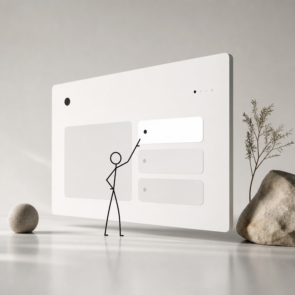
Understanding Interactive Minimalism
Interactive minimalism. Sounds like a paradox, doesn’t it? But here's the thing, it's not just a buzzword. It's an evolving trend in web design that emphasizes both simplicity and engagement. As digital landscapes grow more crowded, the need for clean, user-centered design becomes critical. Ever visited a website littered with flashing ads, pop-ups, and confusing interfaces? Frustrating, right? Interactive minimalism is the answer. By stripping away the noise while inviting user interaction, this approach not only enhances aesthetics but boosts usability.
Actually, let me put that differently: it grants users an uncluttered path to what truly matters — seamless interaction and content discovery. By cutting excess elements, we create breathing room for creativity to shine. This isn't about stripping a site bare; it's about thoughtful reductions that enhance the user experience, harnessing simplicity as a potent tool for interaction and storytelling.
The Core Elements of Interactive Minimalism
So, what makes interactive minimalism tick? At its heart, it's a blend of clean design paired with interactive elements that engage users. Let's dissect this a bit further.
Whitespace and Layout
Whitespace isn't just 'empty' — it's a vital element that guides users’ attention and improves readability. You see, a well-placed blank can focus the mind, inviting users to explore the functional elements of the design. Clean layouts paired with ample whitespace make navigation intuitive, allowing the design’s interactive aspects to shine.
Simplified Navigation
Remember the frustration of getting lost in a complex menu? With simplified navigation, users can find what they need in fewer clicks. By prioritizing essential links and employing minimalistic drop-down menus, users engage effortlessly without the cognitive load of complex navigations.
Engaging Interactivity
Here's the trick: subtle interactive cues like hover effects can significantly boost user interest. For instance, a simple color change or animation when hovering over a button can communicate action, creating a dynamic feel without cluttering the interface.
Real-Life Applications and Benefits
Honestly, the theories on their own may feel straightforward, but let’s ground them in reality. What does interactive minimalism look like in practice, and why bother with it?
Case Study: Apple’s Website
Apple's site is a prime example. It combines sleek minimalism with interactivity, focusing on product imagery and simple navigation. The use of whitespace and interactive product displays captivates users, inviting them to explore without veering into complexity.

Increased User Engagement
Simplified interfaces with interactive components can lead to higher engagement rates. Users appreciate not having to wade through clutter, and instead, they feel encouraged to interact with the core elements present. Websites utilizing interactive minimalism often report longer session times and better conversion rates, a trend highlighted in multiple market studies.
Speed and Performance
By shedding unnecessary elements, websites often become lighter and faster, key factors that enhance user experience and SEO performance. If you want to delve deeper into how these factors influence rankings, check out our piece on automated SEO tools.
Designing Your Interactive Minimalist Website
Ready to create your own? Let's walk through the essentials you can't overlook.
Define Your Core Message
Begin by identifying what message or action is critical for your audience. A clear focus helps in creating a simplified, cohesive design. If your goal is to market a product, make that product and related calls-to-action the centerpiece of your design.
Choose the Right Tools
Here's a hint: choosing the right tools can make or break your project. Consider using content management systems (CMS) that provide flexible design options while focusing on speed and simplicity. For a comprehensive list of tools to get you started, see our compilation of content creation tools.
Prototype Before Implementing
Always prototype! Use mockups and wireframes to visualize how your minimalist interface will function. This step ensures you don't sacrifice functionality during the design process.
Common Pitfalls and Missteps
Designing an interactive minimalist website isn’t without its challenges. Here’s a heads-up on what to avoid.
Over-simplification
Simplicity doesn’t mean sparse. Removing too many elements can lead to confusion or make the site feel incomplete. Striking a balance is crucial; ensure key functionalities and informative content remain accessible.
Poor Interactive Choices
Be wary of extravagant interactions. Overloading a page with animations or effects can negate the benefit of minimalism, adding back unnecessary complexity. Opt for interactions that support usability and content discovery.
The Future of Interactive Minimalism
What's next for this trend? As technology advances, the capabilities for web interactivity expand. The truth is, we'll likely see an increase in the use of AI to tailor web interactions uniquely to user preferences, amplifying the personalized experience. Such innovations herald an intriguing future for web design at large.
Understanding the convergence of minimalism and interaction helps designers craft intuitive and beautiful digital experiences. Grasp its essence, and you hold the power to redefine how users engage with your site. For trend-watchers eager to stay ahead, read our article on emerging digital marketing trends.
Honestly, embracing interactive minimalism may just revolutionize your strategy, aligning user experience with clear, impactful communication. And isn't that what great design is all about?